
LAYOUT SYSTEM
Our layout system is clear and flexible at the same time – the design grid serves as a common basis for our designs and offers a wide range of possible applications.
Ready to start? Get the downloads here!
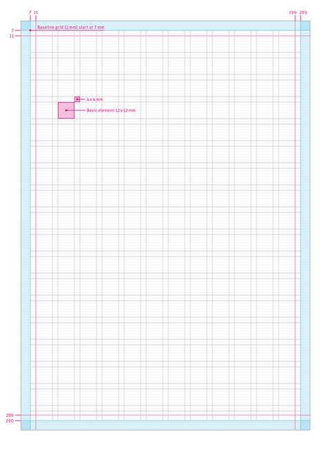
The design grid consists of 12 columns with a column spacing of 4 mm. This results in basic elements of 12 × 12 mm or 4 × 4 mm. The grid is symmetrical and the same for all pages. The baseline grid is 2 mm.
The DIN A4 grid is the basis for all other grids. The width of the individual base element varies depending on the format.
For more details and other formats, go to downloads and see our brochure templates.
Please note:
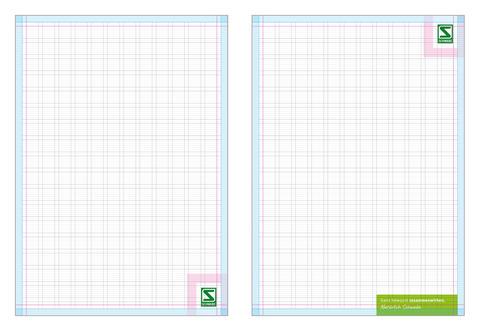
The figures show the updated form of the design for title and back pages. However, previous applications with the Chroma Line on the title are still valid. Newly created materials should follow the new application type.
Design grid on title pages
The design grid on title pages gives a frame for positioning all important elements, such as the Schwabe Flag, the Awareness Tag and headlines.
To learn more about the dimensions and placement of the elements shown, please see Schwabe Flag and Awareness Tag.
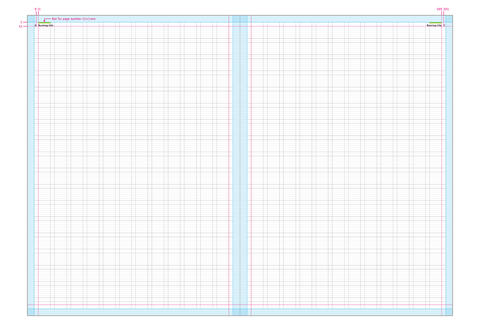
Design grid on inside pages
The design grid is also used in the same form for inside pages. The colour of the bar for the page numbers should be chosen as uniformly as possible throughout the document. It may be used in the colours Schwabe Green, Spring Green and Aqua Green. For all colour variants, white is an alternative when using very dark backgrounds.
If the bar is used for a brochure design in Spring Green, for example, this colour should be used across all pages. If a deliberate accent is to be set or a new chapter is to be started, the colour of the bar may also differ within a document.
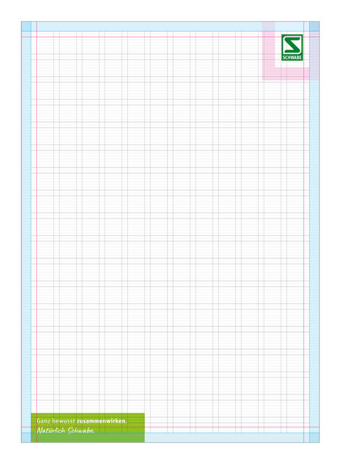
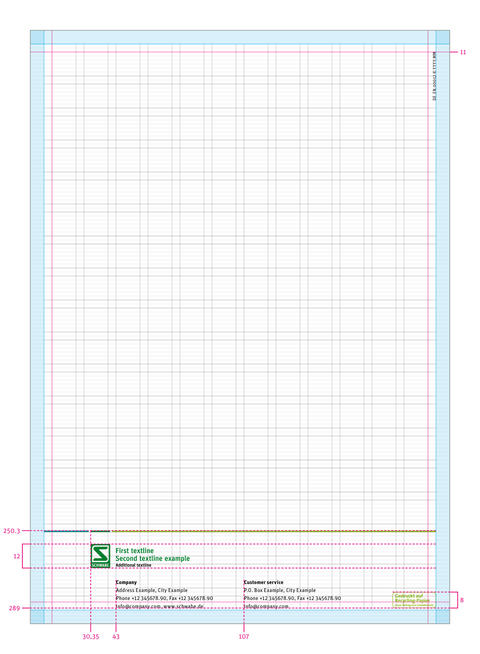
Design grid on back pages
The design of the back is very minimalist. The chroma line sits at a fixed height and forms the area for the logo and all address details below.
The size of the logo and the Chroma line corresponds to the size used for DIN A6 (see Logo sizes for various DIN formats).
Take a look at our design grid in action.
Ready to start? Get the downloads here!