
TYPOGRAPHY
A corporate typeface enhances brand consistency and strengthens visual identity, ultimately fostering greater recognition and trust.
Ready to start? Get the downloads here!
Corporate typeface
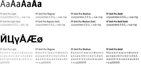
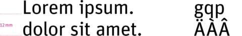
The corporate typeface of the Dr. Willmar Schwabe group is Unit. It is suitable for use in small print, brochures and advertisements as well as large displays and posters. In smaller font sizes, the high contrast between vertical and horizontal lines makes it easy to read.
Depending on the application, it can be used in the weights Regular, Medium and Bold plus their respective italic versions, although italics should be used sparingly. Unit is also available as a web font, reinforcing an image which spans all types of media.
Additional typefaces
Correspondence typeface for office applications
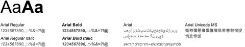
If it is not possible to use the corporate typeface Unit, Arial must be used. Arial is the standard typeface for Office applications used by Schwabe. It is a standard typeface in all Microsoft Word versions from 3.1 (for Microsoft and Apple).
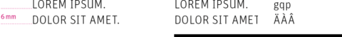
This applies for online and Office applications and other cross-system applications. The figures give an overview of all the special characters contained in the two families.
Typeface for online applications
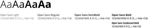
For online applications, we use Open Sans. Open Sans is a sans serif typeface with an upright stress, open forms and a neutral, yet friendly appearance. It was optimized for print, web, and mobile interfaces, and has excellent legibility characteristics in its letterforms. Get it on Google Fonts.
For Headlines, use Open Sans Condensed Bold.
Typeface for Awareness Tag
Caveat is a typeface with a natural handwritten feel, available on Google Fonts. It is used exclusively for the Awareness Tag.

Typeface for employer branding
Nexa Rust is a one-of-a-kind font family that adds a unique, handmade look to any design project. It is available on Adobe Fonts. We use Nexa Rust Sans Black 2 for our employer branding.

Headlines
We have defined various headline formats that are used in the commonly used DIN A formats. These headlines are optimised for use within the design grid and baseline grid in terms of their ease of reading and orientation.
H1
42 pt
H2
32 pt
H3
21 pt
H4
13 pt
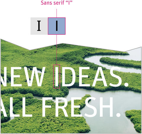
Sans serif letter “I”
On title pages or images that are dominated by a prominent headline, the capital letter “I” is used in its sans serif form. The character is available as an alternative glyph in the Unit Pro font. The “standard I” is used in subheadlines, smaller text headlines or in body text.
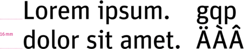
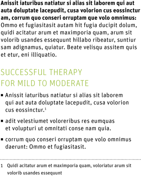
Body text
For brochures, flyers and advertisements, body text sizes have been defined. These are orientated on the baseline grid. A mix of styles and a slightly broken up spacing (+15 InDesign) guarantee maximum ease of reading and print which looks good.
The upper case is only used for emphasising company names or the strapline, and for the headline H4. Items in lists are preceded by square bullet points.
Body text introduction
FF Unit Pro Bold: 9.25 pt
Line spacing: 11.339 pt
Body text
FF Unit Pro Regular: 9.25 pt
Line spacing: 11.339 pt
Subheadline
FF Unit Pro Light: 13 pt
Upper case
Line spacing: 11.339 pt
List
see body text
Footnote
FF Unit Pro Regular: 7.5 pt
Line spacing: 11.339 pt
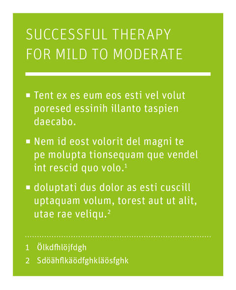
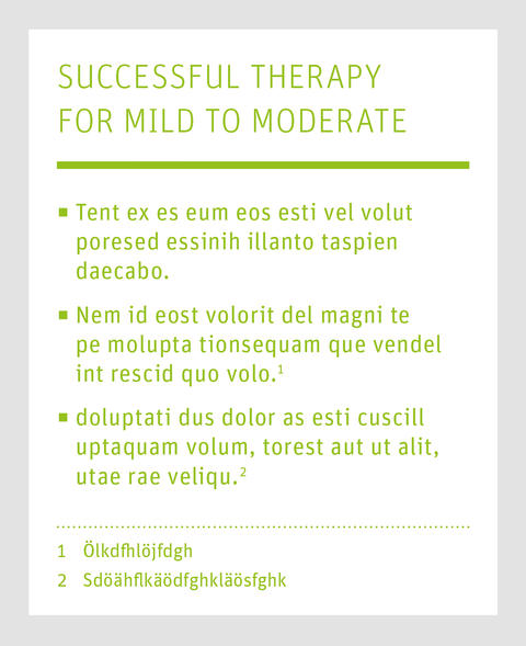
Infoboxes
Infoboxes can be used to emphasise important information. They can be set on white or on an image, and are either white or in Schwabe colours. The headline is separated from the body text by a 1 mm line in the text colour.
Infobox
Examples
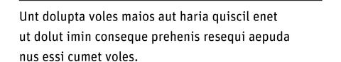
Captions

Ready to start? Get the downloads here!