The logo stands for the company. This means of identification is paramount for a company that operates in the public sphere. The main aim is to recognise at first glance all Schwabe communications as belonging together and to differentiate them from those of other companies. This is what makes a look unmistakeable and memorable, which strengthens the identity long-term.
The logo is the most important design element in corporate design. The Dr. Willmar Schwabe logo consists of a signet combined with wording. The design principle and the combination of signet and wording ensure ease of recognition.
In exceptions / special cases, the signet can be used separate to the word mark (e. g. quality seal, pins, flags, etc.). The use of the signet alone on business stationery (letterhead, business cards, etc.) is not allowed in general. The composition of the logo may not be changed or modified.
Ready to start? Get the downloads here!
The logo consists of two elements: the signet and the wording. Within the logo, the signet is always set at a fixed distance to the left of the wording and there are fixed rules governing its height. The wording consists of the company name and an optional subline.
The company name must run over two lines at most; the strapline one line. One-line company names go on the lower of the two lines provided for the name. The colours of the logo are fixed and may not be changed. These clear design rules ensure ease of recognition.
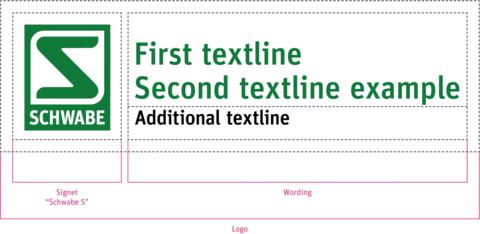
Signet “Schwabe S”
Within the logo, the signet is always set at a fixed distance to the left of the wording. The form of the logo and the colours are fixed and may not be changed. This clear design principle ensures ease of recognition. In exceptional cases, the signet may be used on its own (e. g. trade fair, signage, etc.)
Logo 4c / RGB
if possible, always choose the colour version

Logo B / W
only if necessary for technical reasons

Logo negative on field
may only be placed on “Schwabe Green” field

Colour application positive
positive application on fields with a maximum colour coverage of 20 %

Logo structure (system)
The logo structure is determined by the proportions of the signet. The line weight unit of the signet frame is the determining factor. The additional elements of the logo – such as company name and strapline – are placed accordingly.

Application
There are clear rules for the different applications of the logo. Other applications are not allowed.
Colour application positive
positive application on white fields (if possible, always choose the 2-colour version)

1-colour application positive
positive application on white fields (only if necessary for technical reasons)

Logo negative on field
may only be placed on “Schwabe Green” field
Exception: If a software has a black background (e. g. "dark mode") it is allowed to use the logo negative on black.

B / W application positive
positive application on white fields (only if necessary for technical reasons)

Colour application positive
positive application on fields with a maximum colour coverage of 20 %

Minimum size
The minimum height of the “Schwabe S” is 7 mm. It must be at least this height. In special cases, the “Schwabe S” including wording may also be used in the minimum size of 7 mm.


Exclusion zone
The logo exclusion zone is the minimum distance that must be maintained between the logo and other elements. This is important so as not to reduce the visual impact of the logo.
The logo exclusion zone is equal to half the height of the signet. In exceptional cases, the minimum exclusion zone (¼ of the height) may be applied.
Logo exclusion zone 1 – optimal
Exclusion zone 1 is defined as the minimum distance between the logo and other logos and the margins. It is equal to half the height of the signet.
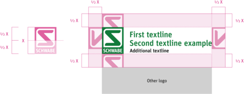
Logo exclusion zone 2 – minimum
Exclusion zone 2 is defined as the minimum distance between the logo and other layout elements (images, texts, etc.). It is equal to a quarter of the height of the signet.

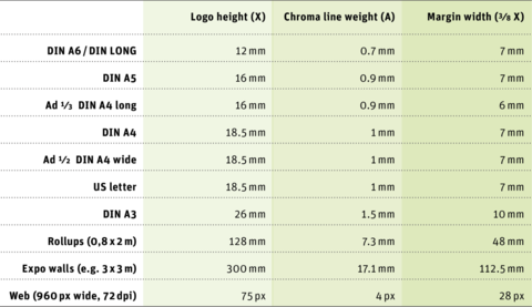
Logo sizes for various DIN formats
The basis for the size of the logo in different media is A4 portrait format with signet height X = 18.5 mm. With formats larger than DIN A3 the logo is scaled up in proportion to the format. With all formats smaller than DIN A4 the logo version with signet height X = 16 mm is used.
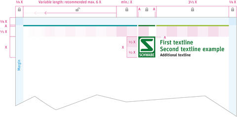
For all undefined formats, the following clearspace measurements must be observed:
logo to Chroma line: ½ X; margin width: ⅜ X
The logo should always be positioned flush right except for web usage.
 Don’ts
Applications on coloured fields or coloured backgrounds that are not allowed (exception: positive application on fields with a maximum colour coverage of 20 %).


Application on image and coloured backgrounds
For optimum logo display on coloured backgrounds (colour coverage from 20 %) or photos, the quality seal is used. It gives the logo the necessary white space to stand out from the background. Both the signet on its own and the combination of signet and strapline can be used.
The quality seal should only be used as an absolute exception, when the layout does not allow for the necessary white space (e. g. for media with full-page image backgrounds).
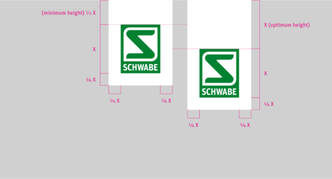
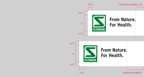
Dimensions
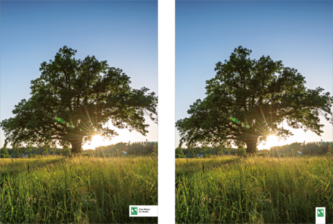
Positioning of the quality seal follows simple rules. It can be positioned in the format from top or bottom, left or right. The distance from the edge is always 7 mm for the commonly used formats DIN A4 and DIN A5.
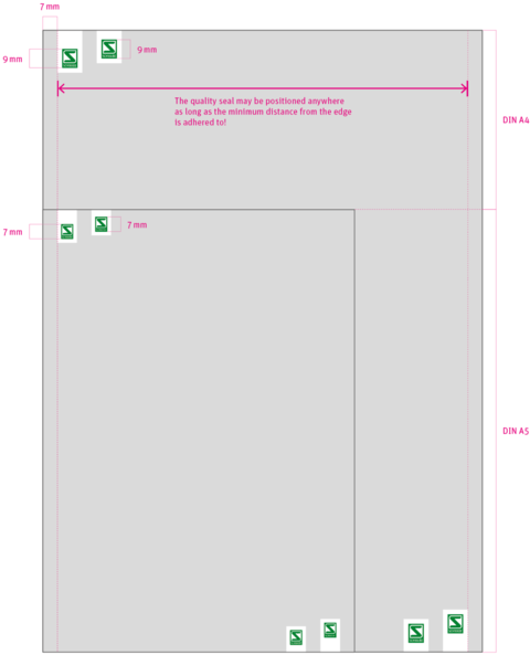
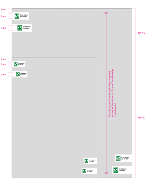
 Don’ts
Positioning of the quality seal follows simple rules. It can be positioned in the format from top or bottom, left or right. The distance from the edge is always 7 mm for the commonly used formats DIN A4 and DIN A5.
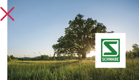

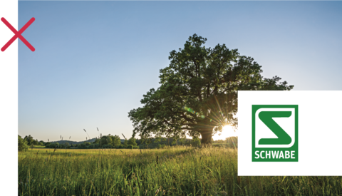



Especially designed for the use on title pages, the Schwabe Flag is a variation of the Quality Seal and corresponds in its shape to the Quality Seal in its minimal height. In contrast to the Quality Seal, the Schwabe Flag is used in a larger size which corresponds to the height of the logo or signet defined for the respective format.
Unlike the Quality Seal, there is no alternative shape or composition option of the Schwabe Flag – its proportions are fixed. Additionally, it may only be used on the right-hand side either at the top or bottom of the page.


The strapline may also be used as supplementary wording to the signet. The strapline is used globally in English over two lines. The coloured applications are fixed.
Please use the strapline as often as possible, as it sums up our purpose well. When using the logo, it should always be placed below the company name.
Colour application positive
positive application on white fields (if possible, always choose the 2-colour version)

1-colour application positive
positive application on white fields (only if necessary for technical reasons)

Logo negative on field
may only be placed on “Schwabe Green” field

B / W application positive
positive application on white fields (only if necessary for technical reasons)

Colour application positive
positive application on fields with a maximum colour coverage of 20 %

 Don’t
Don’t
the German version of the strapline is no longer used

Ready to start? Get the downloads here!
