In a largely digital world, print media stands out – especially when designed with high-quality finishes. They offer quality, durability and, not least, a haptic experience. They enhance credibility and foster deeper connections, ensuring that all audiences, including seniors, are effectively reached.
As a responsible company, we make sure to use paper grades with a high recycled content wherever possible. High-quality recycled papers are now available in many countries, which are a good fit for our company and our public image.
For printing office stationery, brochures, posters, etc., choose paper with a “pure white” appearance which is smooth and pleasant to the touch (premium-type). DON’T use textured or yellowish paper (e. g. canvas finish, handmade paper, watermarks, etc.).
In production, the data must be adapted to the material used; it is recommended to get contract colour proofs before going to production. For finishes such as gloss etc., please consult the producer beforehand and tailor it to the individual print product.
If the desired type and / or weight of paper is not available, be sure to use substitutes that are as similar as possible in terms of finish, colour, feel, etc.
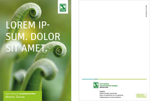
DIN A4
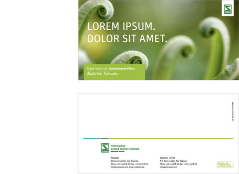
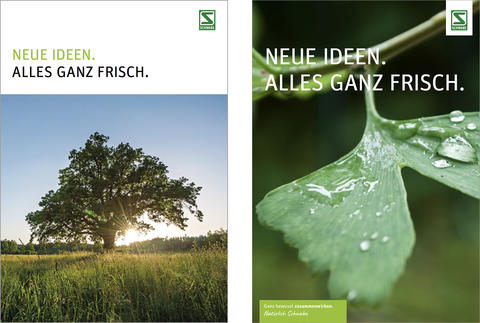
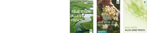
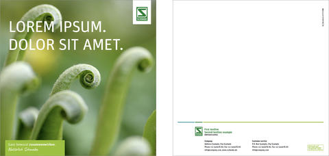
Title
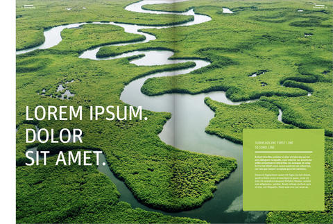
Marginalised images on the front pages extend the layout options. Headlines are set in upper case and left-aligned and can be used flexibly up to a maximum defined size per format. This applies to both white and full-surface images.
For light backgrounds up to an opacity of approx. 20 % colour application, the headline is set in two colours as on white.
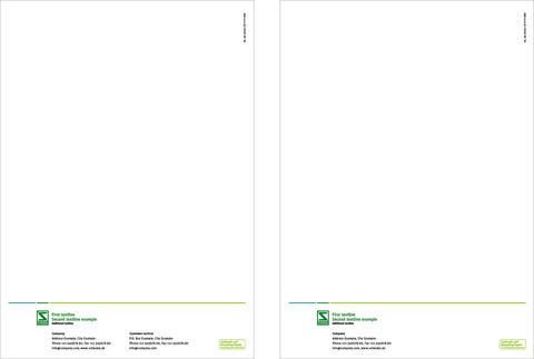
Back
The design of the back is very minimalist. The chroma line sits at a fixed height and forms the area for the logo and all address details below.
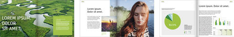
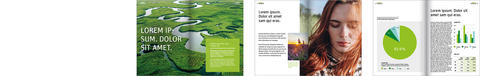
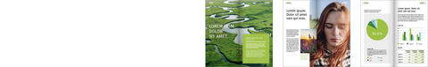
Inside pages – intro
Intro pages impress with large images and an appealing text structure. The amount of text is very reduced and provides an initial insight into the topic of the brochure / flyer.
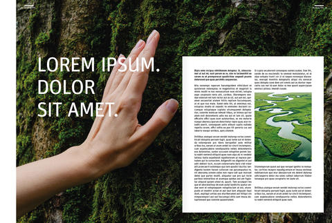
If a headline does not stand out enough from the image motif, it can be provided with a subtle drop shadow in a matching colour where necessary. The drop shadow should be large and smooth so that it blends well with the background image and no recognisable shadow shapes are created.
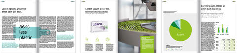
Inside pages – text/image
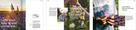
Text/image combinations are the most common page type and can be designed in a wide variety of ways using the elements familiar from the templates. This creates a varied and at the same time consistent appearance.
Rectangular or square images and colour areas can be selected for all page types. A free handling of the images makes the structure exciting - images can, for example, run across the page, overlap or be presented as an appealing combination.
The standard text format is ragged typesetting. However, if the text typesetting contributes to the design, justification may also be used in addition to justification.
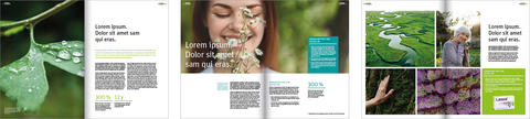
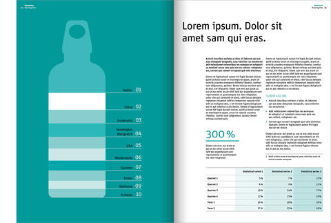
Inside pages – information
Information pages contain more content than the other page types. Large graphics and clearly organised content nevertheless make this page type interesting and present the most important facts in a visually appealing way.
Square 210 x 210 mm
The layout is based on the DIN A4 starting point. Design elements are used in their original size. The templates provide orientation for this. The aim is to convey a uniform appearance across different formats.
DIN A5
The layout is based on the DIN A4 starting point. Design elements are used in their original size. The templates provide orientation for this. The aim is to convey a uniform appearance across different formats.Design elements are used in their original size as far as possible.
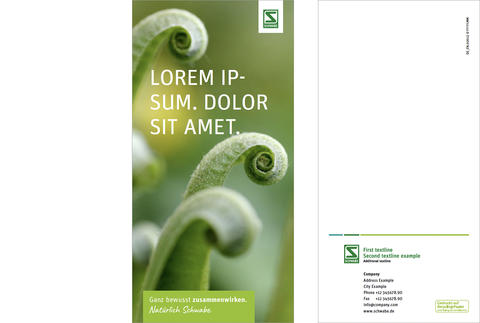
DIN long 105 x 210 mm
The layout is based on the DIN A4 starting point. Design elements are used in their original size. The templates provide orientation for this. The aim is to convey a uniform appearance across different formats. Design elements are used in their original size as far as possible.
DIN long landscape 210 x 105 mm
The layout is based on the DIN A4 starting point. Design elements are used in their original size as far as possible. The templates provide orientation for this. The aim is to convey a uniform appearance across different formats.